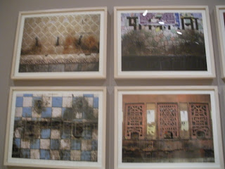
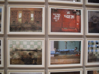
The WLCM BCK show consisted of art works by the Mason Gross School of the Arts MFA Graduates. This show has no specific main theme, there are 41 artist’s work represented at this show. They were asking to submit small to medium size work for this exhibition. I have picked in total of 4 pieces of artwork that I will be discussing about in details.
This work is called CNC, 201 by Wendy White. The medium is Acrylic on canvas with the dimensions of 37.5” x 43. This work caught my attention first because of its untraditional canvas shape on the top and also with its bright multi-colored canvas. Wendy teaches painting for the BFA students at Mason Gross. I heard that she deals with graffiti art as well. It seems like in this painting, she did not have to use a paintbrush to produce this work. The acrylic color that seems by the number 23 looks stenciled on. With the background of black spray-painted over the whole piece really makes the whole painting sticks out. I find this work very interesting also from the canvas bars that stuck out on top, it almost looks like a skateboarding staircase railings. This piece really suits the kind of graffiti artwork you would see near the skateboarding places in a park.
This piece is called “Fuller Landscape (Dymaxion Dweling Machine/Wichita House)” and the artist is Julie Langsam. The medium is oil on canvas. This piece should be my favorite piece in the whole WLCM BCK show. Even though I do not quite know what the theme this painting is about but I can tell that it deals with architecture in the future. The Wichita House seems like it is a kind of transportation similar to subway that transport along the red and orange gridded squares. The Wichita House is so small compare to full size of the canvas; it really makes you focus on the details in the architectural house, which is the main focus of the painting. The sunset sky creates soothing dynamic warmth to the whole painting with the harsh bright red, hot pink, color blocks on the bottom. It is almost like two different kind of dimension interacting with each other. The drawing of the house and the ground seems so futuristic and unrealistic, but with the realistic sky, it can be view as a futuristic landscape painting of future architectures.
This painting is called Checkpoint, 2010 By Caetlynn Booth. The medium is oil on linen on wood panel is dimention of 16’ x 48’. I noticed this painting next to the “Fuller Landscape” painting because I think these two works really compliment each other in terms of its abstract use of geometrical shapes and angles. A lot of diamond shaped crisscross pattern is going on here, which creates this 3D texture and turn it into landscape. The landscape seems like it’s a view from looking down on the ground. The blue paint on the bottom seems like water that’s spilled and left on the foreground and its sipping part of the painting on the very bottom. The more I look at it, the more I think it looks like a sidewalk and the curb of the street. However, I’ve been trying to figure out what the red on the right top corner is. This piece is made of mainly crisscrossing from two angles but it has a certain depth perception in it. So that is why I also considered this painting to be landscape as well.
This last piece is exhibited in the tribute show to alumni of Mason Gross who past away and created scholarship fund. This piece is work of art by Lyda Craig. “Untitled, 2000”. The medium is mixed media on panel. I chose this piece because I think it has unique use of medium. The artist used paint and threads from sewing with all mixtures of colors and seems to bundle them all up into a thread ball. From far away, it looked quite disturbing because at first I thought it was a ball of hair hanging of canvas but when looked close the details of the thread intertwine and tied to each other really complicates the whole painting to something different. I’ve always enjoyed work that adds other type of man-made product or any items to an canvas, it makes the painting looks like there is more to it than just paint on fabric. I think this work chose good use of medium and used it with freedom. Even though the brushwork is more messy and thick, some looks like splashed paint. With the mingled up threads kind of messing with the whole composition of the painting, ended up creating a very scary looking painting that sucks you in. I think it’s ironic because threads are usually used to for sewing cloths together. People usually think of “neat” when they think of thread. But when I think of thread, I think it’s a mess because every time when I take thread box out of my drawers, all the different colored threads are all tangled up with one another and its just a big knot. That kind of visualization popped up in my head when I saw this painting


